Two-tone watches (steel & gold): a quiet luxury comeback in 2026
For a long time, two-tone watches, combining steel and gold, were associated with a very specific aesthetic, sometimes perceived as dated or overly marked by the 1980s and 1990s. In 2026, that perception has clearly shifted...
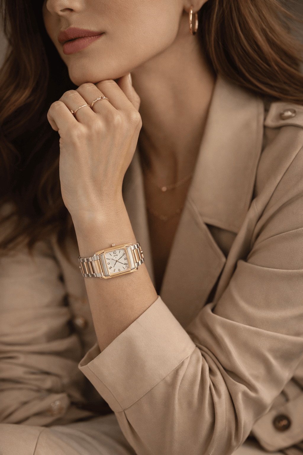
Long considered outdated or overly flashy, two-tone watches are now making a noticeable comeback in a new form: more discreet, more elegant, and perfectly aligned with the aesthetics of “quiet luxury”. The combination of steel and gold is once again appealing thanks to its versatility, particularly in the world of women’s watches. Neither too formal nor too ostentatious, the two-tone watch stands out as a balanced choice, just as relevant at the office as it is in everyday life. In this article, we explore the reasons behind this renewed interest, the iconic models worth knowing, and why vintage two-tone watches now represent a particularly attractive option on the pre-owned market.
What is a two-tone watch?
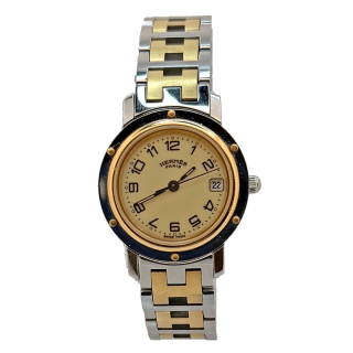
A two-tone watch combines two different metals, most often steel and gold, within the same case or bracelet. This pairing can take several forms: gold center links on a steel bracelet, a gold bezel, or more subtle alternations between polished steel and yellow or rose gold. The objective is not purely aesthetic: historically, two-tone was designed as a compromise between durability, elegance and status.
Widely introduced from the 1970s and 1980s onward, steel-and-gold watches long embodied a certain idea of accessible luxury. More discreet than a fully gold watch, yet more sophisticated than an all-steel model watches, they quickly found their place in both women’s and men’s collections. Today, this duality makes perfect sense once again, in a context where restraint and stylistic longevity take precedence over ostentation.
Contrary to common belief, two-tone is not limited to a bold or overtly vintage aesthetic. When well executed, this combination results in a balanced, easy-to-wear watch capable of transcending trends without looking dated. It is precisely this adaptability that explains its strong comeback, particularly among elegant watches designed for everyday wear.
Why two-tone embodies “quiet luxury”
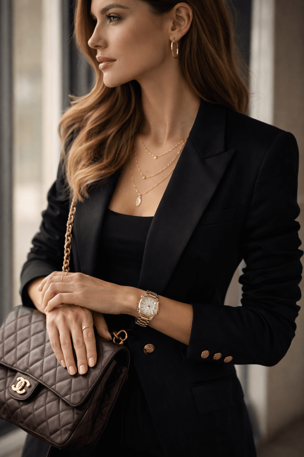
The concept of quiet luxury is built on a simple idea: prioritizing quality, discretion and durability over visible or exaggerated status symbols. In this context, the two-tone watch finds its place naturally. The pairing of steel and gold adds a precious touch without ever tipping into ostentation, an equilibrium that is especially sought after today.
Unlike fully gold watches, which are often perceived as more formal or socially marked, two-tone pieces retain a sense of restraint. Steel structures the watch, bringing functionality and modernity, while gold highlights lines, catches the light and enriches the design with subtlety. This controlled contrast perfectly aligns with contemporary codes of understated luxury.
In professional settings, this aesthetic is particularly relevant. A steel-and-gold watch integrates seamlessly with office attire, whether paired with a tailored suit, a blouse or a minimalist outfit. It accompanies the wrist without imposing itself, while still expressing a refined personal taste. This ability to be noticed without being loud explains why so many women are once again drawn to this type of watch.
The return of two-tone also fits within a broader rehabilitation of timeless pieces. At a time when trends move quickly, quiet luxury values objects capable of enduring over time without losing relevance. Two-tone watches, especially in their vintage versions, perfectly embody this philosophy.
An ideal aesthetic for women’s watches
If two-tone is resonating so strongly today, it is also because it perfectly meets the aesthetic and practical expectations associated with women’s watches. The combination of steel and gold adds visual richness, allowing the watch to go beyond its purely functional role and approach that of a true piece of jewelry. This dimension is particularly appreciated in feminine models, where balance between elegance and legibility is essential.
Two-tone watches often feature slimmer proportions, finely crafted bracelets and softly contoured cases. Gold highlights curves, structures the dial or illuminates the bracelet, while steel provides neutrality and balance. The result is a watch that is easy to wear every day and can be paired just as naturally with gold jewelry as with silver accessories.
This versatility also explains why steel-and-gold watches are especially suited to professional use. They add a touch of sophistication without ever appearing excessive, making them elegant office watches. Worn alone or combined with a slim bracelet, they fit seamlessly into a restrained, modern and controlled style.
Finally, two-tone creates continuity between the watch and the rest of one’s jewelry. Rings, necklaces and bracelets can be mixed freely, which perfectly reflects current “stacking” and mix-and-match trends. In this context, the two-tone watch becomes a central style element, both functional and expressive.

Iconic two-tone watches to know
When discussing the two-tone trend, certain watches immediately come to mind. Not because they follow a passing fashion, but because they have incorporated steel and gold into their aesthetic DNA for decades. These historical models are often what give bicolor watches their image of discreet, timeless luxury today.
Rolex Datejust: the archetype of elegant two-tone
It is impossible to talk about steel-and-gold watches without mentioning the Rolex Datejust. Offered since the 1950s in countless bicolor variations, it has played a major role in establishing two-tone as a confident and elegant choice.
In women’s sizes as well as intermediate case diameters, the Rolex Datejust combines the robustness of steel with the warmth of yellow or rose gold, resulting in a watch perfectly suited to everyday life: precious enough to stand out, yet understated enough for office wear. In 2026, it remains one of the most obvious references when searching for an elegant, timeless and versatile watch.
Cartier Panthère: two-tone designed as jewelry
At Cartier, the Panthère embodies a different vision of two-tone, more jewelry-inspired and more fluid. Here, steel and gold are not used to create contrast, but rather to draw a visual continuity, almost like an articulated precious bracelet.
In its bicolor versions, the Cartier Panthère is naturally worn as a watch-jewel, often alone on the wrist. Its soft, feminine aesthetic makes it a particularly sought-after piece in the world of vintage and pre-owned watches, where variations in bracelets and finishes offer a richness rarely found in contemporary production.
Cartier Santos and Tank: more discreet two-tone interpretations
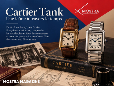
While they are less systematically associated with bicolor designs, certain Cartier Santos and Cartier Tank variations also exist in steel and gold, particularly among pieces produced in past decades.
On these models, two-tone is more subtle: gold accents on the bezel, gold center links, or refined details that gently warm a steel base. This type of combination is especially appealing to those seeking an elegant watch that is not immediately identifiable as “bicolor”, perfectly aligned with a quiet luxury mindset.
Other vintage steel-and-gold watches worth exploring
Beyond the most famous icons, many watchmaking houses have produced compelling two-tone models over the years that are now particularly interesting on the pre-owned market. Pieces from Omega, Tudor and other more discreet brands offer elegant alternatives, often at more accessible price points, while preserving that delicate balance between cool metal and precious metal.
In all cases, it is the proportions, the refinement of the bracelet and the overall coherence of the design that determine the success of a two-tone watch, far more than the mere presence of gold.
Why two-tone is especially interesting on the pre-owned market
If the steel-and-gold trend is returning so strongly in 2026, it is also because the pre-owned and vintage markets offer two-tone watches a much richer field of expression than the new market. Historically, brands produced bicolor versions with proportions, bracelets and finishes that have sometimes disappeared from current collections. And above all, with a two-tone watch, interest goes beyond color alone: everything depends on balance and on how gold “warms” the steel.
More balanced proportions (and often more flattering on the wrist)
Many vintage two-tone watches were designed at a time when case diameters were more restrained, profiles slimmer and bracelets more integrated. These are precisely the codes making a comeback today: finesse, discretion and everyday elegance. On a woman’s wrist, such proportions often look more natural than certain modern versions that are larger or more massive.
A diversity of tones (yellow, rose, champagne) rarely found in modern production
Two-tone is not a uniform block. Depending on the era and reference, gold can appear warmer, rosier or softer, sometimes even leaning toward champagne hues. On the pre-owned market, this palette becomes a real advantage: one can choose a very discreet bicolor (almost tone-on-tone) or, conversely, a sunnier and more assertive version, without being locked into a single aesthetic.
Two-tone “quiet luxury”: readable luxury without excess
The paradox of two-tone is that it is both recognizable and extremely easy to wear. In 2026, as quiet luxury favors details that are noticed without being imposed, steel and gold align perfectly: they catch the light, add depth to a silhouette, yet remain less direct than a fully gold watch.
In pre-owned pieces, this effect is often even more successful, thanks to finer finishes and more restrained designs: less “statement”, more natural elegance.
A smart balance between style and budget for accessing iconic pieces
For many buyers, two-tone also serves as a gateway to highly desirable models. It delivers a sense of preciousness, and therefore a jewelry dimension, while remaining more accessible than full-gold versions. In short: more warmth, shine and sophistication, without the significant price jump.
Patina works in favor of bicolor watches
Unlike certain finishes that age poorly, steel and gold often benefit from wear. A soft patina, less aggressive polishing, gentler reflections on the metal, all of this can make a two-tone watch feel more “alive” and authentic. In a vintage context, this is one of the charms of bicolor pieces: they tell a story while remaining perfectly wearable.
What to check specifically on a pre-owned two-tone watch
Because two-tone watches combine two metals and rely heavily on finishing, certain points deserve special attention on the secondary market. It is important to examine the consistency of gold tones, the balance between polished and brushed surfaces, the condition of gold center links or accents (often the most exposed areas), as well as the quality of the bracelet and clasp.
A well-preserved steel-and-gold watch should retain its harmony. If gold appears overly flattened by excessive polishing or if the lines lack definition, the quiet luxury effect is quickly lost. Conversely, a two-tone watch with crisp edges, a healthy bracelet and coherent finishes is often one of the most rewarding watches to wear daily.
How to wear a two-tone watch today
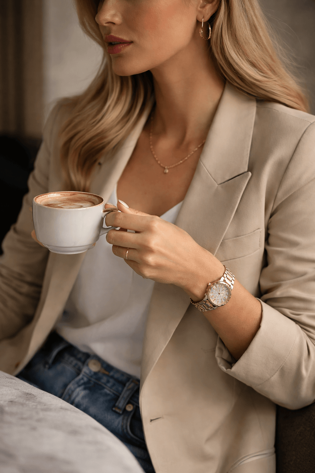
Two-tone (steel and gold) has a rare advantage: it integrates effortlessly into an outfit while instantly adding light to the wrist. In 2026, it is worn less as a status symbol and more as a style detail, a warm accent, a jewelry touch, a way to soften a minimalist silhouette. The good news is that there are many ways to wear it, from the most discreet to the more assertive.
1) Two-tone in “quiet luxury” mode (the easiest for everyday wear)
The most contemporary way to wear two-tone is not to draw attention to it. Imagine a white shirt, raw denim or tailored trousers, a fine knit, neutral tones (cream, grey, beige, navy). The steel-and-gold watch acts as a warm focal point: it catches the light while remaining balanced.
The right instinct: let the watch stand alone on the wrist, without multiplying accessories. In this spirit, iconic models such as a two-tone Rolex Datejust, a steel-and-gold Cartier Panthère, or certain versions of the Cartier Santos or Cartier Tank naturally fit into a calm, composed aesthetic.
2) Office, meetings, daily wear: two-tone as a “professional jewel”
At work, two-tone is often more effective than a full-gold watch (sometimes too assertive) and more refined than an all-steel model (sometimes too neutral). It conveys care and polish without ever being aggressive.
Two combinations that work particularly well:
- Tailored suit / blazer + two-tone: gold softens the lines and adds femininity.
- Monochrome outfits (black, white, beige, navy) + two-tone: the watch becomes the defining accent.
3) Casual chic: modern contrast
A steel-and-gold watch worn with casual attire is one of the most current signatures. Denim, knitwear, clean sneakers, a trench coat, the two-tone watch suggests that the detail has been considered without overdoing it. It is also a simple way to elevate a basic silhouette.
The key here is to keep other jewelry minimal. The watch already plays a jewelry role.
4) Evening wear: a more assertive approach (without excess)
In the evening, two-tone can feel more precious, especially when the watch features high-polish finishes, an integrated bracelet or a jewelry-inspired design. The idea is not to overload, but to create a point of light that structures the wrist.
If the outfit is already strong (dress, jumpsuit, neckline), the watch should remain balanced: one well-proportioned piece is enough. If the outfit is very simple, the watch can become the central accessory.
5) Metals and jewelry: must everything match?
Two-tone has a practical advantage: it allows gold and silver jewelry to coexist without visual conflict. In 2026, the logic is more about harmony than strict rules.
- You mostly wear gold: two-tone works perfectly, adding just enough steel to stay modern.
- You mostly wear steel or silver: two-tone introduces discreet warmth without imposing a “full gold” look.
- You mix metals: two-tone naturally becomes the balancing element.
6) Stacking (watch + bracelets): yes, but with one rule
With a two-tone watch, stacking can quickly become too much, as the watch already combines two metals and reflects light. If you choose to layer, one rule applies: lightness.
- a slim bracelet, ideally in one of the two metals present;
- or a very simple bangle worn on the opposite wrist to avoid overload.
7) Common mistakes to avoid (that ruin the chic effect)
- Multiplying shiny jewelry on the same wrist: the result quickly becomes cluttered.
- Mixing too many warm tones (yellow gold, rose gold, champagne) without a guiding thread.
- Choosing an overly bulky watch when the goal is discreet elegance: two-tone becomes ostentatious.
When worn this way, two-tone finds its true place in 2026: a watch that is easy to live with, flattering on the wrist, and sufficiently jewelry-like to add style, without ever becoming a passing trend.
How to choose a vintage two-tone watch
Two-tone is one of the most flattering styles on the wrist, but also one of the most demanding on the pre-owned market. Because it relies on balance between two metals, any inconsistency in finish, wear or proportion is more noticeable than on an all-steel watch. Especially in 2026, as two-tone returns through a quiet luxury lens, the goal is not to buy “a bicolor watch”, but a watch whose bicolor is harmonious, stylistically meaningful and durable for everyday wear.
1) Solid gold, steel & gold, plating: understanding what you’re buying
First and foremost, it is essential to distinguish between the different realities behind “steel and gold”. On the vintage market, you may encounter:
- solid gold elements (on the bezel, crown or certain links), durable and value-retaining;
- steel with real gold components (often the reference configuration);
- plated gold or gold treatments, more sensitive to wear and requiring careful evaluation.
This distinction is crucial, as it directly impacts longevity. For a “quiet luxury” result that ages well, configurations using real gold elements, even partial, are generally the most satisfying over time.
2) Balance of the bicolor: the number-one rule
On a two-tone watch, style depends on gold distribution. Too little, and it becomes anecdotal; too much, and the watch may shift toward a more “statement” look than quiet luxury. The most successful models are often those where gold structures the design (bezel, center links, indexes) without overwhelming the whole.
A good visual test: imagine the watch with a very simple office outfit (white shirt, fine knit, tailored trousers). If it remains elegant without drawing excessive attention, it is usually a good sign.
3) The bracelet: where everything is won (or lost)
On a vintage two-tone watch, the bracelet is often the most exposed part and the one that defines the jewelry-like feel. Points to check include:
- condition of gold links: gold should not appear overly worn or uneven;
- flexibility (on articulated bracelets): too much play can feel tired;
- clasp quality: crisp, secure, not loose;
- tone consistency: bicolor should remain visually coherent.
A two-tone watch can look stunning in photos yet lose all charm if the bracelet is overly worn or slack. Conversely, a healthy bracelet immediately conveys quality and presence.
4) The polishing trap: preserving lines
On vintage watches, excessive polishing can destroy the design, and on two-tone pieces, this is even more visible. Edges soften, contrasts fade, and the watch loses definition. To stay aligned with 2026 aesthetics (discreet luxury, clean finishes), prioritize:
- well-defined lines;
- a balanced polished/brushed contrast;
- intact proportions (lugs, bezel, case contours).
Two-tone works best when finishes are legible. When everything is overly smooth and uniform, the watch loses much of its appeal.
5) Dial, indexes, hands: coherence and legibility
With two-tone watches, there is often a temptation to seek out highly ornate dials. Yet in a quiet luxury approach, the most successful dials are usually the most balanced: light, champagne, silver or white, with indexes that catch the light without dominating.
The key question: does the dial complement steel and gold, or does it compete with them? Harmony is essential.
6) Size and wearability: think “visual effect” before millimeters
As with jewelry watches, stated case size tells only part of the story. On two-tone watches, the bracelet and bezel strongly influence presence. A 31 mm watch can feel very present if gold is prominent or the bracelet is wide, while a larger diameter can remain discreet with softer bicolor tones.
The right mindset: aim for a watch that accompanies the wrist without dominating it, especially if daily and office wear are the primary uses.
7) The “right” vintage two-tone watch: effortless wearability
Ultimately, the best vintage two-tone watch is the one that becomes easy to wear. It works with your jewelry, complements simple outfits, transitions effortlessly from day to evening, and never feels forced. It doesn’t need to try too hard, its appeal comes from line quality and harmonious finishes.
This is precisely why icons such as the Rolex Datejust, Cartier Panthère, and certain Tank or Santos variations remain so desirable: they were designed so that two-tone is not an effect, but a true aesthetic language.
Frequently asked questions about two-tone watches (steel & gold)
What exactly is a two-tone watch?
A two-tone (or bicolor) watch combines two metals, most often steel and gold. This pairing may involve the bracelet (gold center links), the bezel, the crown or dial details. The goal is to balance the sobriety of steel with the warmth of gold, resulting in a more jewelry-like yet often more discreet watch than a full-gold model.
Are steel-and-gold watches really trendy in 2026?
Yes. The return of two-tone fits into a deeper movement: quiet luxury, appreciation for timeless pieces and the search for accessories that are easy to wear every day. Bicolor watches meet these criteria by adding light, depth and refinement without ostentation.
Are two-tone watches easy to pair with jewelry?
This is one of their greatest strengths. A steel-and-gold watch naturally bridges gold and silver jewelry, making it easier to mix rings, bracelets and necklaces, provided harmony (slim volumes, overall coherence) is favored over accumulation.
Which type of two-tone best fits “quiet luxury”?
The most quiet-luxury-appropriate versions are those where gold is present but well distributed, on the bezel, center links or subtle details, without overwhelming the watch. Overly contrasted or highly polished bicolor designs tend to feel more “statement”. Softer tones (champagne gold, refined finishes, slim proportions) integrate more naturally into discreet luxury.
Vintage two-tone: what should you prioritize?
On the pre-owned market, focus on bracelet condition (play, wear), consistency of gold tones, absence of excessive polishing (over-rounded edges), and overall harmony between case, bracelet and dial. On a two-tone watch, these details directly impact wrist presence.
Solid gold or plated: does it really matter?
Yes. Pieces featuring real gold elements, even partially, generally age better and retain their appearance more effectively. Plated or treated gold can be interesting but requires closer inspection, particularly on high-friction areas such as center links.
Can you wear a steel-and-gold watch at the office without overdoing it?
Absolutely. This is one of the contexts where two-tone shines most. It is often more subtle than full gold and more refined than all-steel. With sober attire (shirts, blazers, neutral tones), it delivers a professional, polished look without excess.
Conclusion: two-tone, a lasting return rather than a passing trend
The return of two-tone watches in 2026 is not a fleeting trend. It reflects a broader desire for readable yet discreet luxury, for pieces that are easy to wear every day, and for accessories capable of aging gracefully. Steel and gold meet these expectations perfectly, bringing structure, light and warmth in equal measure.
When approached through a quiet luxury lens, two-tone becomes a true aesthetic language: neither overly jewelry-like nor purely utilitarian, but a subtle balance that works just as well at the office as beyond. And it is precisely on the pre-owned and vintage market that this trend finds its richest expression, through finer proportions, timeless designs and a diversity of finishes that allow each wearer to find a watch truly aligned with their personal style.
Chosen carefully, a vintage two-tone watch is not merely fashionable. It becomes a wardrobe staple, a watch worn effortlessly, paired naturally with jewelry and outfits, and offering what more and more women are seeking today: calm, confident and lasting elegance.
These products might interest you


Share this content